

THE PROBLEM
The existing landing page underperformed on conversion. Karan wanted a site that read as new-age and Gen-Z appropriate, credible for a Naukri-era-disrupting product.
When the engagement started in early 2025, UnoJobs already had a brand identity in place. What it did not have was a website worthy of the brand. The existing landing page was underperforming on both conversion and messaging. Feature explanations were buried below generic hero copy. The visual language did not yet feel new-age. Karan, founder and CEO, wanted a site that read as Gen-Z appropriate, visually stunning, and credible for a hiring platform competing directly with Naukri and LinkedIn. The Naukri-era visual ceiling is low. A modern Indian consumer brand sitting next to a 2008-aesthetic legacy player is itself a positioning decision. The website needed to do that work before any candidate or employer ever clicked further into the product.

The original UnoJobs app was designed by the developer who built it. Visually basic, dated, and not competitive with Naukri or LinkedIn.
UnoJobs already had a job-seeker mobile app live on Google Play and the App Store. The catch: it had been designed by the original developer who built it, not a product designer. Everything technically worked. Nothing was tuned for a user. Visual hierarchy was generic, interaction patterns were inconsistent, and the app sat below the quality bar Naukri, LinkedIn, and Indian Apna had set for the hiring-app category. The 500-download baseline before the revamp reflected that gap. The brief was direct: rebuild the entire app from zero. Every state, every edge case, every transition redesigned. Inheriting an app designed by a developer is its own category of design problem: respect the workflow that already works, then redesign every surface to match what a 2025 consumer hiring app should feel like.

Candidates and employers want different things from a hiring platform. A single site has to welcome both without feeling like two sites stitched together.
UnoJobs is a two-sided marketplace serving both candidates and employers, with revenue coming from both sides. Candidates need fast job discovery, video-resume tools, map-based search, and frictionless application flow. Employers need candidate discovery, AI-powered shortlisting, match-score sorting, and interview scheduling. These are two completely different mental models. A landing page that leads with employer features alienates candidates. A landing page that leads with candidate features fails to convert hiring teams. The information-architecture decision underneath the redesign: dedicated surfaces for each audience without forcing users to declare themselves before reaching the value prop. The main landing page welcomes everyone, the Employers page and Candidates page each go deep on audience-specific features, the Jobs and Company Careers pages serve search and brand-led recruiting respectively.
THE DESIGN JOURNEY
Information architecture first. Mood-boards with the founder. Landing page locked, then cascading the visual language across every surface.
Karan's specific visual taste set the direction. IA mapping per page set the structure. The landing page locked the design language. Every other page inherited it.
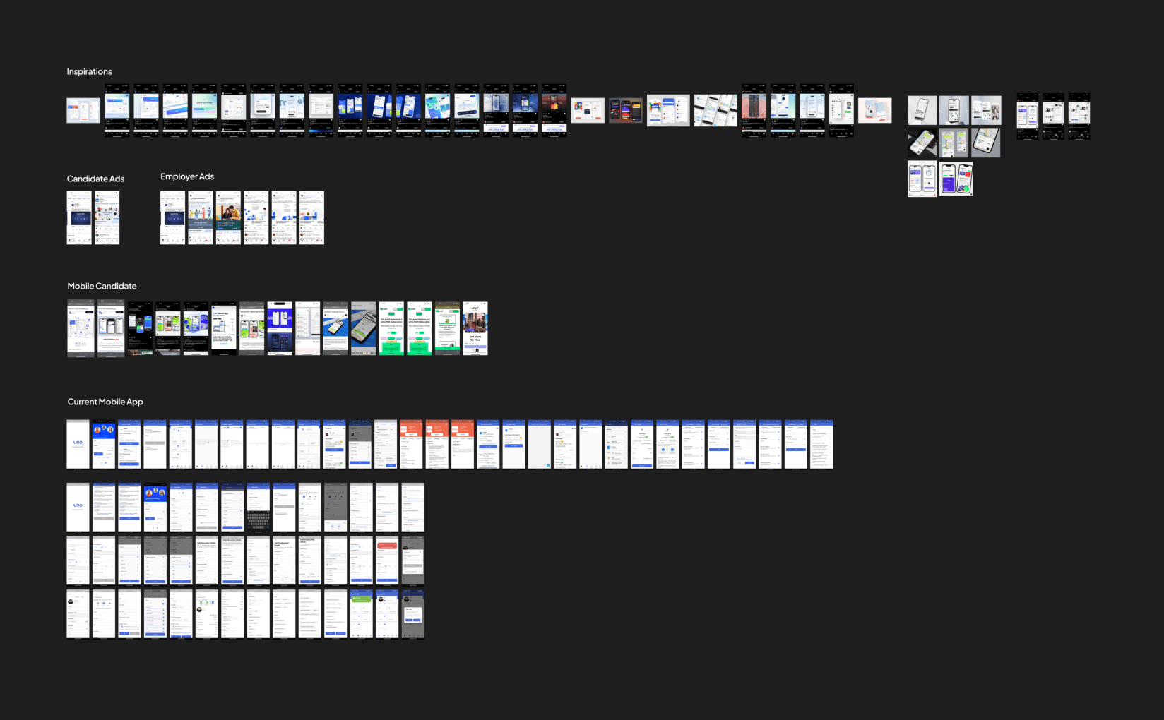
Every page got a full information-architecture mapping before any pixel pushed. What goes on the page, in what order, with what hierarchy.
Most agency website projects start with a hero mockup and reverse-engineer the architecture. The UnoJobs engagement reversed that sequence. Every page got a full information-architecture mapping before any visual design started. What sections belong on this page, in what order, with what hierarchy, addressing which audience question. The Employers page IA opens with the speed-of-hiring promise, then the AI-match value prop, then the workflow illustration showing how a hire actually happens, then social proof, then conversion. The Candidates page IA opens differently: video resume and quick-apply video lead because those are the platform's most novel features for that audience. Map-based job discovery follows. Then jobs available, then signup conversion. The Jobs and Careers and Blog pages each carry their own IA logic. Pixels followed the architecture, not the other way around.

Karan had specific visual taste and was closely involved. Multiple style explorations before picking a direction.
Karan ran the visual direction with specific opinions, especially on the mobile app. The first phase of every workstream was mood-boarding: Karan shared design styles he liked, references that captured the new-age Gen-Z feel he wanted, and visual cues from outside the hiring category that could differentiate UnoJobs. The design team translated those references into multiple style explorations before locking a direction. Back-and-forth on colour, type, UI elements, and layout treatment ran in parallel sessions until Karan approved the direction. Only then did high-fidelity work begin. This rhythm produced a visual identity that felt earned rather than imposed: every choice in the final website and app was traceable to a Karan-approved direction, which meant zero rework once high-fidelity shipped and zero ambiguity for the developers who built against the spec.
The main landing page set the visual language. The 9+ other pages inherited from it without reinventing.
The cascade discipline that worked on AccioJob and Hatica also defined the UnoJobs engagement. The main UnoJobs landing page locked first across hero, feature showcase, conversion flow, and footer. Once that visual language was approved by Karan, the Employers page, Candidates page, Jobs page, Company Careers page, Blogs surface, register and login screens, and download-app pop-ups all inherited the same type system, colour palette, component primitives, and layout grid. SEO-aware structure shipped alongside the visual redesign: heading hierarchy, URL patterns, internal linking, and content chunking treated as design decisions, not afterthoughts. The cascade meant the site read as one product across 10+ pages rather than 10 disconnected layouts, and post-launch updates from UnoJobs's marketing team could ship new pages faster because the system was already in place.
THE SOLUTION
A 10-page website, a 25 to 30 screen mobile app rebuilt from scratch, and the post-launch sales and social collateral.
Three deliverables under one engagement. Each carries its own design problem. Each shipped to live customers.

Landing, Employers, Candidates, Jobs, Company Careers, Blogs, register, login, download-app pop-ups, marketing-to-product transition flows.
The website ship covered 10+ distinct pages with full responsive web and mobile coverage. Main landing page with hero, feature showcase highlighting quick-apply video, video resume, and map-based job discovery, and a multi-section conversion flow. Dedicated Employers page with workflow illustrations for the fastest-way-to-hire promise. Dedicated Candidates page with feature deep-dives. Jobs page as the primary search-results surface for finding roles. Company Careers page so employers could showcase their own listings as a branded careers page. Blogs surface for hiring-content SEO. Register and login screens designed for both candidates and employers. Download-app pop-ups and CTA flows routing users from web to Android and iOS. Transition flows handling the handoff between unojobs.com and the candidate product. Every state, every breakpoint, every interaction documented for the development team.

25 to 30 screens redesigned end-to-end across iOS and Android. Three to four months of deep work.
The mobile app revamp was a 3 to 4 month deep-work engagement covering 25 to 30 screens for the job-seeker app on iOS and Android. Every screen redesigned end-to-end: profile creation, video resume capture, quick-apply video, job search by role and city and department, map-based job discovery, saved jobs, applications tracking, application status, and every supporting state. Every empty state, loading state, error state, and edge case redesigned. Every transition between screens reconsidered. The workflow that already worked stayed intact, the visual language and interaction patterns rebuilt completely. Mood-boarding with Karan locked the visual direction first. Information architecture and user flow mapping followed. Low-fidelity wireframes iterated with Karan until the structure locked. High-fidelity UI then applied the approved visual language across every screen. Developer-friendly handoff with tokens, components, and full state coverage.

Brochures, one-pagers, sales materials, Instagram and LinkedIn and X templates. Same visual language across every surface.
After the website and app went live, the engagement extended into the surrounding collateral consumer-facing brands need to ship cross-platform. Sales brochures and one-pagers for employer-side conversations carrying the same visual language as the website. Social media post templates for Instagram, LinkedIn, and X covering hiring announcements, candidate spotlights, and recruitment campaigns. The same brief-and-approval loop ran on every collateral piece: Karan briefs, design ships, back-and-forth on approval, then production. The discipline that mattered: every collateral surface had to read as the same UnoJobs. A user clicking from a LinkedIn post to the website to the app should feel three points on the same brand, not three different products. Cross-surface brand continuity is how consumer-facing platforms build recall.

THE KEY MOMENT
One designer carrying every surface a Naukri-era-disruptor needs to ship.
Most hiring platforms build their public surfaces in pieces. The website is one designer's job, the mobile app is another's, the sales collateral is freelance, and the social templates are an internal marketing-team afterthought. The compound result is a brand that reads as four different products to a candidate or recruiter who actually moves between those surfaces. UnoJobs took the opposite path. Every public surface across the engagement, from the 10-page website redesign to the 25 to 30 screen mobile app rebuild to the post-launch sales brochures and social templates, was carried by one designer with one visual language. A candidate landing on a LinkedIn post recognises the hiring-platform brand by the time they reach unojobs.com. A recruiter receiving a sales brochure recognises the same brand again on the Employers page they click through to. A job-seeker who downloads the mobile app from a website CTA encounters the same component primitives, type system, and colour palette they just saw on the marketing site. This cross-surface brand continuity is what consumer hiring platforms get wrong most often and what UnoJobs got right. The 500-download baseline pre-revamp reflected the gap between brand ambition and brand execution. The post-revamp lift in downloads and sign-ups reflected what closing that gap is worth. Single-designer multi-surface ownership is not always the right model, but for a consumer brand entering a category dominated by 2008-era visual languages, it is the fastest path to a brand that actually feels like 2025.

The work, in detail.
Website pages across the audience split, mobile app screens across the candidate journey, video-first feature flows, map-based job discovery, sales collateral, and social post templates.


Unojobs
industry:
Consumer, AI
SCOPE:
Website
,
Mobile App
,
Creatives
duration:
1 Year
key outcome:
100+
screens designed E2E


